Great cities need great libraries: a review
-
I’m remembering a man in the nineteen sixties, seated, head down at a table in the Henry Watson Music Library (second floor Central Ref). There are several slim, bound manuscripts stacked in front of him, one pulled forward, open. He’s quietly humming, in a light, breathy tone that doesn’t sound to have travelled very far. I see him here often.
The first time I came across him he was alone in the city’s smallest, slowest lift, getting out as I was stepping in. He wasn’t expecting the doors to open. His mind must have been elsewhere. The dark blue trilby hat in his right hand quickly went to his face, which he lowered, as though to avoid recognition.
I surprised him later, in the stacks, without his hat. Half his face was collapsed towards his chest, as though it were melted wax. The other half was a deep molten purple, in which bubbled a dark, startled eye. We both looked away.
I’m seeing him now, in my memory, humming along to the score. Content in the corner, barricaded by the printed music that he reads and quietly sings along to. I got to recognise his smile. In this new 2014 Henry Watson Music Library my friend could, if he had chosen, play along on the Roland electronic drum kit, or one of the pair of Yamaha piano tutors. Or he might have used the music composition software on the Mac. Or he might just have stayed behind his scores, humming.
Fount of wisdom, parish-pump, seat of learning, bed of nails. One man’s holiday camp is another’s penitentiary, literary dream, crammer’s nightmare.
Fount of wisdom, parish-pump, seat of learning, bed of nails. One man’s holiday camp is another’s penitentiary, literary dream, crammer’s nightmare. Libraries are many things; dispensary of information, certainly, receptacle of ideas, of course; codifier, moderator, historian, scientist, musician, actor, cartographer, philosopher, linguist, traveller, playwright. Crucially, a library is a place of manners, courtship and copping off.
Say what you like, essentially libraries are where a certain type of teenager (in the sixties they listened to The Beatles and Dylan, seventies Roxy and New Wave, eighties Smiths and David Sylvian, nineties, help me out) goes to test drive their latest hair cut, skin cover-up, tee-shirt slogan come-on. Exam revision is the front. Light revision, at that.
I’m sorry for the generation deprived of this hormonal test bed for the last four years. Get down to St Peter’s Square and do some catching up. There are loveseats for God’s sake; loved-up chairs with hearts embossed in the upholstery. And big comfy woolly sofas. In his autobiography Little Wilson and Big God, Anthony Burgess, ever an enthusiastic witness to his own bad behaviour, claims / fantasises seduction by a librarian behind the card index. No guarantees though.

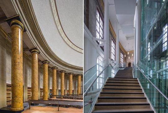
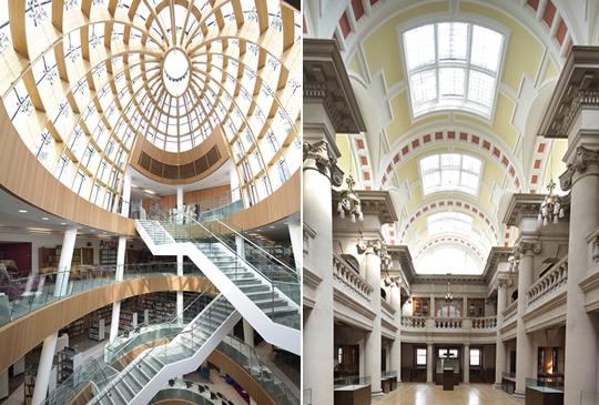
I’m in the big domed Wolfson Reading Room on the first floor. The refurbishment here has had a light touch. Heavy furniture, much of it designed by the building’s architect E Vincent Harris, is wonderfully restored. So too the chirpy echo, which somehow has the same effect as the universal librarian’s “shush”. It is quiet and studious in here. My only regret, the lovely great circular “O” of the central desk, below the gilded column-borne clock, no longer has activity behind or around it.
This is where you would request reference books to be brought up from the stacks via the spiral staircase that unwound below the desk. The stacks are gone, but for an indicative corner, maintained behind glass on the ground floor, at the request of English Heritage. I’m told the books give off a very studious aroma. There’s no activity in front or behind this beautiful desk now, which contradicts the attention it so powerfully commands in the room. Some tall stools and the day’s papers might well do the trick.
Four years and £48m later, Central Library is a triumph. Five thousand square metres of additional public space, thoughtfully arranged and wonderfully appointed.
I’m not about to chide at much else. Four years and £48m later, Central Library is a triumph. Five thousand square metres of additional public space, thoughtfully arranged and wonderfully appointed. In 2010 30% of the library’s floor space was public, 70% staff access only. Today the numbers are reversed; 70% is public and 30% is back of house. Loveable as it was, the somewhat frosty, idiosyncratic and rather incoherent building has been so successfully transformed, from inside you’d think the city just got bigger.
Ryder Architecture, Newcastle based, but overseen by their Liverpool office, has done the trick. I am told that Ian Kennedy, a Ryder director, brought forward the idea of removing the theatre (originally a lecture hall) and the stacks, opening up an entirely new ground floor and basement. This unlocks the building. The single central lift is stripped out, replaced by two fully glazed and, for once, very elegant scenic lifts that rise through the building and address each new landing with great command of space.
The all-new staircase is pinned to the inside of the library’s curving outer wall. The white-painted steel work that anchors the structure is clearly contemporary, but the stairs themselves, and the glass balustrading somehow combine to look of-a-piece with the original Vincent Harris structure. This is a tribute to careful selection of materials. The curvature of the staircase reinforces the integrity of the Harris design and somehow confirms the rightness of scale, volume and geometry.
“Every great city has a great library”, says Neil MacInnes, Manchester’s Head of Libraries. Birmingham got a brand new one in 1974, and never liked it much. It is massive, brutal and unloved. Architect John Madin created the inverted ziggurat in concrete. In its time it was the biggest non-National library in Europe. I say unloved, but concrete fetishists and fans (including myself) of the nearby New Street station signal box may quietly withdraw in to mourning, when it is demolished later this year. For the moment, you may walk through the building at the ground floor, to get to the all-new, gift- wrapped stack of boxes that is the Library of Birmingham. It opened in 2013, at a total cost of £188.8m.
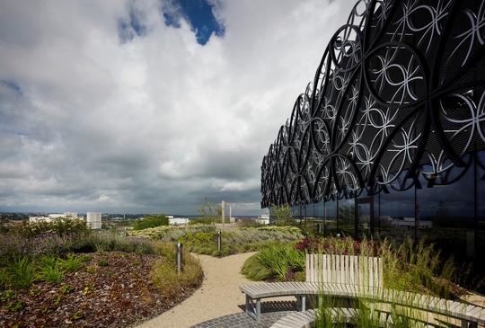
[Above: Birmingham Library's Secret Garden]
It is a big two-tone building wrapped in a veil of silver and black steel rings. There are ten floors stacked in three boxes, two blue, one gold. They balance on a glazed single-storey entrance hall that is shared with Birmingham Rep. It is the eye catcher on Centenary Square which it also shares with Symphony Hall, and Convention Centre. Birmingham continues to reconnect central areas wrecked by joy riding ‘sixties planners.
Mecanoo, the hot Dutch architects headed by founder Francine Houden won the Library design competition run by the RIBA. Which is baffling to me, since I could find no logic to the building whatsoever. It is big in all the wrong places, small where it should not be, and, for a library, almost spitefully illegible. The foyer is much too big and wasted (even with the nick-knack shop) for the tight revolving-door entrance. It is a considerable hike to the basement lending library, past an enormous blank white wall that is probably 40 x 30 metres. I presumed it temporary, waiting to be dropped to reveal exciting spaces behind. “No, it’s just corridors behind there” says David, my guide. “We are thinking of using it for additional signage. Even though we’ve got loads, people just don’t seem to find their way down here.” It isn’t going to work David.
There are two floors locked off to the public half way up the building. These are the environmentally controlled archive stores, and they rather knock the thing of balance. There’s a somewhat forlorn and doubtless painstaking reconstruction of the original Victorian Shakespeare Library, long ago outgrown and now accessible by labyrinthine low, marrow corridors, or by lift. It seems to serve no function other than to demonstrate the art of Victorian cabinet making. Perfect, though, for small, strongly themed weddings. There’s a panoramic viewing area up here too, offering views over the city. Well, a little less than half the city, actually.
City viewing is far better served on two impressive open terraces. The one at second floor is atop the cantilevered first floor canopy. It overlooks the square, and is a real bonus for the building. The Secret Garden terrace is lovely, but open spaces at level seven are most often breezy in these latitudes. There is a tall stair between the café and additional seating on a mezzanine. It isn’t wide enough for two people to pass with their lunch trays. There are conferencing and meeting rooms that were full of rugby players when I visited. Big blokes in over-detailed suits. A bit like the library.
It does feel rather as though a bit of Liverpool One has crossed over William Brown Street. Given the overall quality of the retail development, this is no bad thing.
If Border’s had survived the credit crunch (if only!) it’s Liverpool branch might have looked a lot like the new Liverpool Central Library. It does feel rather as though a bit of Liverpool One has crossed over William Brown Street. Given the overall quality of the retail development, this is no bad thing. There’s rugby ball- shaped atrium rising through the public half of the building, and popping out through the roof terrace. It is timber-lined and domed in glass. There are four bridges rising through the space. Not only are they pleasant to use, they greatly add to the interest and drama of of the whole volume. Atrium light is pleasantly shared around, but as is the way with atria, floor plates and circulation are compromised.

Quite why the restored Picton Library now resembles a collision between the British Museum Reading Room and Kids Unlimited is a bit beyond me, but pre and Primary school users get big change out of all three of these schemes. Liverpool, alone amongst them is PFI (as is the successful new library in Brighton), and a very good one at that. Shepherd Construction put up the £55m and Austin-Smith:Lord is the architect; specifically Chris Pritchett, who has previously worked magic at John Ryland’s Deansgate Library.
Why libraries? Why now? I suggest that the engine of regeneration was winding down before 2008. Big metropolitan authorities will always play the political game and offer up gifts to the electorate. Festivals, gardens, goats or donkeys, the sacrifice will be suited to the acolyte. A big central library suits the universities, the intelligentsia (if you will) and the sensitive middle classes. Handled in the right way, it will also suit a whole suite of minority interests. This is not the role of Branch Libraries whose territory these days is much more in the line of social services than literature, research and learning. Which is not me saying that any library closure is in any way a good thing.
I make no apology for believing that almost irrespective of the scale and nature of the sacrifices made to benefit Central Library, it has been worth it. This is much more than the sum of its parts.
When architect Norman Foster was making his successful bid to remodel New York Public Library (which is 87 buildings) he sent one of his team to photograph Levenshulme Library, where he first came across Frank Lloyd Wright, Louis Sullivan and Le Corbusier. Libraries can change the world. I make no apology for believing that almost irrespective of the scale and nature of the sacrifices made to benefit Central Library, it has been worth it. This is much more than the sum of its parts.
Graham Cavanagh and his team of Ryder Architects set up an office on site for the duration. They sat opposite the team of Ian Simpson Architects who simultaneously refurbished E Vincent Harris’s other great building, the Manchester Town Hall Extension. Central Library now has an entrance into the Extension, and what used to be the gas and electricity showrooms is now the Media Lounge. Down the gentle slope to the all-new lending library, spanning the basement and breaking through into Central Library itself. People have suggested the lending library is perhaps a bit tucked away. I suspect it will come more into play when the whole of the phased work in St Peter’s Square is complete.
In Manchester books have been disposed off, cue outrage. The fact is that more of Central Library’s stock is now out on the shelves, and there is a whole additional floor on which to use them. More of the archive is now digitised, and is progressively so. The interactive technology assembled by Mather & Co on the ground floor is simply the best I’ve seen. The North West Film Archive now has a fine public face and the BFI Mediatheque makes film a seriously catalogued and archived medium accessible within the collection.
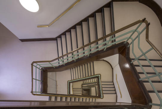
Going up the stairs from third to fourth floor is where you will see that the complexity of the original steel framed building, is not compromised by new interventions. If anything, it is even more pleasing. I’m told that the two project teams had a genuinely creative collaboration throughout, which is highly unusual, and credit to client and project management. Apparently, they worked on a simple single thesis; WWHHD: What Would Harris Have Done?

I’m prepared to bet that no public building in the UK today has furniture that is a better speced (by interiors outfit SpaceInvaders). Today there’s a man sprawled on a grey fabric sofa, engrossed in whatever it is he’s reading. He looks neither slovenly, nor out of place. He just looks right. You may think me biased, but I think Manchester now has the best library in the UK after the British Library (of which I’m a big fan). As one well known Mancophile put it to me the other day, “In through the Shakespeare Hall out through the Rates Hall. Perfect. So why are they f*****g up Library Walk”. That’s another story.
I’m not sure we need another word to attach to the word Festival, but here’s one any way; Library. Chetham’s, John Ryland, Portico, Central; The Manchester Libraries Festival. I suggest no other city, including London, is better placed.
Images of Manchester Central Library by Morley Von Sternberg
Contributor Profile
Freelance writer, broadcaster and curator with special interest in architecture and urban issues. If you haven't caught if already, his TEDxManchester talk on the city's architecture is a rare treat. He's also responsible for an ongoing, and successful series of pop-up galleries.


