Kissing At A Distance
Maria Balshaw arrived as Director of the Whitworth Art Gallery at the University of Manchester in 2006. She had the railings that fenced the building off from the surrounding park, removed within a year.
That was the beginning of her powerful subversion. Saturday 14 February 2015, with 18,000 love-struck visitors walking through the gleaming galleries and around the building, was the finale of her full-scale occupation. The new spaces and wholesale refurbishment, by MUMA Architects, was always about the park.

Maria Balshaw’s Whitworth signals the University Campus, offering itself to Moss Side and Rusholme with as much front and side as its Edwardian forebear showed reticence. This determined woman has brought on a building both solid and attractive. This is a shiny polished thing, linking arms with brick and stone. Here is Jacob Epstein’s frost-white marble Genesis, her proud African-mask head and pregnant child-full torso, bathed in light, gazing young and defiant, across the park to Moss Side. You can see her from the grass. There are huge internal light oak doors facing woodland. Stand in Whitworth Park and glimpse the work and the life of the gallery. The conversations are obvious.
The park will complete this gallery, not the other way round. As it happens (on any building site) the landscaping will be the last to finish. MUMA (McInnes, Usher, McKnight) are architects who met as students in Glasgow. In Glasgow’s Pollock Park is the building they surely have drawn on.
The Burrell Collection, by architect Barry Gasson from 1983, is one the greatest Scottish buildings of the last fifty years. Gasson brings the park and woodland indoors, through glass and considered vistas. The Whitworth doesn’t quite achieve this. The park remains stubbornly “out there”. At the Whitworth though, there is the added dimension of the intense city beyond.
Opposite the Whitworth Gallery, as if it were planned, stands the Eye Hospital (part of the Manchester Royal Infirmary). Buses trail back and forth along Oxford Road, worker bees sucking at bus stops. Just south is the Curry Mile; bento, tiffin and thali, shisha, hookah, sarees and kurta, and some of the best on-street fruit and veg in the city. Life as thick and colourful as a Gillian Ayres oil painting.
Maria Balshaw’s Whitworth straddles continents, and conflates time. Nikhil Chopra, the artist from Mumbai spent 65 unbroken hours in the then Whitworth building-site for the 2013 Manchester International Festival. He plays the parts of field workers and mill hands (still very much alive in present day Gujarat and Xinjiang) and draws the global span of the city: charcoal on paper, Coal on Cotton.
Whitworth has always been a textiles gallery. Display cases, like milliner’s windows, line an interior high street laid out in the 1960s. From the front door, through the lobby - now with the shop on both sides - cross Textiles Street to Drawings Square. This middle Whitworth is what those of us mid-century kids grew up on. Not just the Warhol Marilyn’s, Richard Hamilton, Roger Hilton, Bridget Riley, Elizabeth Frink, but the timber, stone and glass of the Bickerdike & Allen mid-century remodelling. Open Plan, open minds.
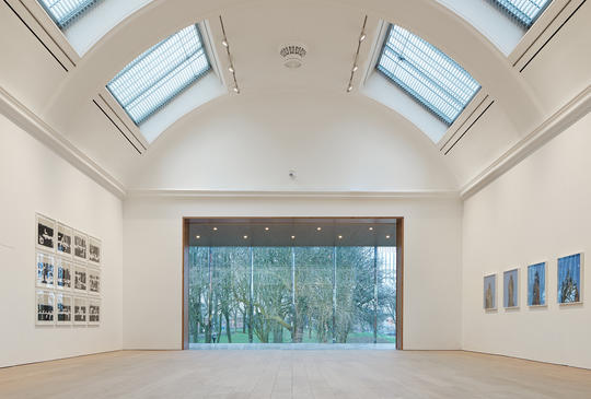
It was architects Bickerdike & Allen who flagged the way to the Whitworth’s future. They created a garden gallery to the south aspect of the building, connected back in two places, and punched big window openings in the arched outside wall. This triple height, wooden-floored un-obstructed gallery is flooded with warmth and seasonal green light. And a generation of young Manchester artists got their Big Whitewall Ambition.

The architects inserted a mezzanine, invoking yet more sixties glamour. A sensational cantilevered double-rise staircase sprouted unsupported from one wall, in terrazzo treads with stainless steel spindles and oak banisters. And from the mezzanine, a Juliet balcony, overlooking the garden gallery below. This defined the sixties for many young Mancunians and students, and MUMA has paid it every respect. Respect.
GATHERING OF STRANGERS is the illuminated fairground sign over the back door. It is work by Glasgow artist Nathan Coley that marks the new entrance off the park and Denmark Road. The new door, to the new build. Like much of the new construction, is solid, overt and well thought out. You have come in through the park, and skirted the new Art Garden, designed, but not yet laid, by Sarah Price.
This space is between the two new wings that project from the rear of the building. North wing is a triple-height box, in warm orange brick. The Whitworth site slopes from front to back, so part of the study and learning facility that wraps round the rear of the building is at ground level here. Above it is the big new space they call the Landscape Gallery. Turn left through the door and climb the broad (for me, slightly over-detailed) granite staircase.
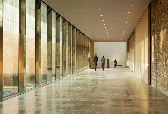
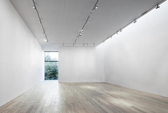
Pass below David Batchelor’s kinetic pendant sculpture, Plato’s Disco, and pause at the top of the stair. Stretching before you is the main promenade. On your left is the brick back-wall of the original building, on your right, the new glass wall on to the park.The Landscape Gallery is a belter. Top-lit by a North-facing glass fronted wedge inserted into the top of the structure, which not only does the trick, but looks the business from street-level. There’s a massive double-height window looking out on the park from the far end of the gallery space.
From now until 21 June, this great space contains a large-scale wall and floor work by the Chinese artist Cai Guo-Qiang. There’s a clue in the full title: Unmanned Nature: Project for the Hiroshima City Museum of Contemporary Art.

This 45 by 4 metre drawing on Chinese hemp, wraps around the walls and is reflected (a little redundantly) in the shallow pool that takes up 80% of the floor. A dozen people may walk around it at a time. Did I mention the drawing is made of gunpowder and scorches, and that it was fabricated on the ground by placing detonators below the hemp, and firing them, singly, and in clusters? Watch the video. For once, I appreciated the work - which is already hugely impressive - even more when I learnt how it was made.
Cornelia Parker does explosions too. And bullets, conflicts and transformations. Cold Dark Matter: An Exploded View has hovered in the art firmament for more than twenty years. At Whitworth her famous exploding garden shed does its hummingbird act beneath a deadpan barrel vault, in a gallery all to itself. The shadowlands it conjures feel galaxy-wide. There are bullets and blood in her work, and always the feeling of a magician’s transformation, illusion, and deception. Joseph Whitworth, Victorian engineer and our ultimate benefactor, standardised the world’s screw threads and developed a particularly deadly rifle. He and Cornelia might have had much to talk about.
Sheds in space have other parallels here at The Whitworth. Take a greenhouse, glasshouse, glass box, in the length-to-height ratio of, say 3:1, and lay it along a neat pile of bricks so it overhangs at the end. This, in model, is the café in the trees. Art aside, it is the galerie coup de couer.
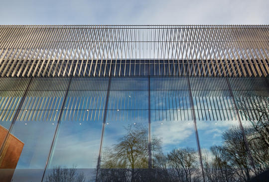
From the Art Garden we know the café to be a glass structure that sits on top of the kids’ art room. It is, in fact, the new building’s main theme. A long glass gallery for eating cake. Slender weightless Danish furniture in a sleeve of glass and mirrors. The mirrored steel struts at metre intervals have a triangular profile that carries through the whole building in a variety of forms (including some of the art: cf Plato’s Disco). Dazzling. What might have been a touch blingy, is carried off in a flourish. It is the carefully considered accessory that sets off the entire outfit.

If you find the right spot - left at textiles, and just at the entrance to the garden gallery - you have a gorgeous front-to-back view of the length of the building; Oxford Road to the park. This, because stud walls from the ‘sixties have been removed, revealing the gorgeous 1889 stairwells with their Oriel bay windows. And because the back wall of the garden gallery has been punched through to connect with the new glass promenade. It is lovely.
The new Whitworth has grown by a third. Publicly accessible areas are increased twofold. Expectation is that carbon consumption will be reduced by 10%. This because of the nifty use of things called earth tubes, and ground source pumps buried in the park. The carbon-conscious might have expected more; biomass heating using coppiced timber, heat converters, brown water collection, composting food waste? As you enjoy your Danish pastry on your lovely Danish chair, look to the far-end glass wall of the café. Almost all of it is one of the most elegant (and doubtless eye-wateringly expensive) folding doors I’ve ever seen. That’s one hell of a way to deal with solar gain in a glass box.
The MUMA scheme shifts accommodation around and successfully augments an already considered brief. All for an incredible £15m. I’m not sure the embrace of park and gallery is yet quite so fulsome as Maria and her collaborators might wish. There’s a bit of the Cornelia Parkers about it: The Distance: A Kiss with Added String. There is an embrace all right, but like Cornelia’s appropriated Rodin, there are strings that need unravelling yet. Whitworth Park and Gallery are officially now an item, as they paraded on Valentine’s Day.
Give them time - a spring, summer, autumn and winter, say - and see if they are even closer, come the first anniversary.
Contributor Profile
Freelance writer, broadcaster and curator with special interest in architecture and urban issues. If you haven't caught if already, his TEDxManchester talk on the city's architecture is a rare treat. He's also responsible for an ongoing, and successful series of pop-up galleries.


